Elevate awareness, enhance patient education, and improve overall community health while maintaining a strong presence in the community.
Solution
Evolve the brand expression to better inform, educate, and engage a growing patient profile on the benefits of an innovative patient-centric approach to healthcare.
Positioning
Branding
UX/UI
Marketing
A Careful Rebranding
Hunter Health was created in 1977 to offer care to Native Americans who needed it most. Today, the healthcare provider serves all who need care in Wichita, Kan., and the surrounding region.
The clinic came to Howerton+White with a clear goal — to rebrand the growing organization but not walk away from how it began. The mission was to define who they are today while keeping their Native American roots in mind.
That started by updating its brand promise to: “Care that embraces all of us.”
"Our brand identity refresh reinforces our commitment to improving the health and wellbeing of everyone in our community."
Research Informs Insights
Our process begins with a comprehensive research phase to ensure we deeply understand our client’s landscape. We conducted a thorough communication audit for Hunter Health, delving into its existing messaging strategies and brand positioning. Our competitor analysis provided insights into the competitive landscape, allowing us to identify opportunities for differentiation. Through audience research and keyword research, we gained valuable insights into Hunter Health’s target audience and their language, allowing us to tailor our marketing efforts.
Creating Clarity With Brand Identity
To elevate Hunter Health’s brand presence and effectively communicate its unique value proposition, we worked with its internal teams to refine its brand foundation. We integrated its existing brand language into our visual positioning and digital design strategies. We updated their logo to clarify their brand expression, allowing for better digital application and a more cohesive and consistent brand identity. A brand atlas was the final step in ensuring a fully integrated brand across all touchpoints, helping Hunter Health better position and differentiate itself in the marketplace.
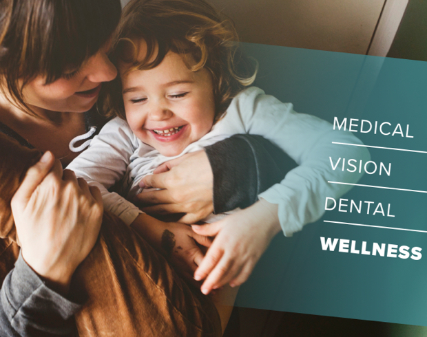
Integrated Care Model Informs User Journey
Hunter Health utilizes an integrated care model that provides patients with access to all necessary medical, dental, behavioral, vision, and pharmacy services, a unique approach not commonly found in low-cost clinics. To effectively communicate their story and establish a positive relationship with patients, Hunter Health collaborated with H+W to develop a user-friendly website that facilitates connection. The website is HIPAA-compliant, which ensures patient privacy. Visitors can easily find the right page to learn more and make appointments. The website includes strong calls-to-action, like contact or click-to-call buttons, on essential pages to encourage higher conversions.
Optimizing A Website to Increase Donations
Through strategic streamlining of the user experience, H+W helped the clinic reach several goals, including making it easier for users to donate by increasing visibility and lowering the entry barrier. Hunter Health also wanted to introduce an active blog to showcase its expertise, make provider pages more accessible, and provide easy access to important pages such as the patient portal and billing. And, of course, highlight their comprehensive range of services on the website.
Comprehensive Capital Campaign Support
For Hunter Health’s Capital Campaign, we played a pivotal role in defining naming conventions, refining positioning language, and crafting compelling support materials. Our efforts included developing a comprehensive presentation deck, correspondence suite, letterhead, business cards, thank you cards, site maps, one-sheets, donor outreach, and brochures, providing Hunter Health with the tools to effectively communicate its vision and garner support for its new campus initiatives.
Supporting Community Initiatives
Our partnership with Hunter Health extended to providing campaign support for critical initiatives such as HIV screening and support, COVID screening and vaccination, and flu shots/vaccines. Leveraging our expertise in healthcare marketing, we developed targeted campaigns to raise awareness, drive engagement, and promote community well-being, aligning with Hunter Health’s integrated care model. We also crafted social assets, core business assets, and templates, including brochures and posters, to reinforce Hunter Health’s brand messaging across different channels and touchpoints.
Signage Enhances Patient Experience
Recognizing the importance of physical presence and client-facing communication, we assisted Hunter Health in planning and directing its environmental signage efforts. H+W developed a master plan with a matrix to bring all campuses and facilities under one brand. From location signage to wayfinding solutions to physical room designators, we ensured consistency in branding and messaging, enhancing the overall client experience and reinforcing Hunter Health’s commitment to holistic well-being.