


The Road to Understanding
A look at the deep thinking and UI/UX design behind DriveKS.com
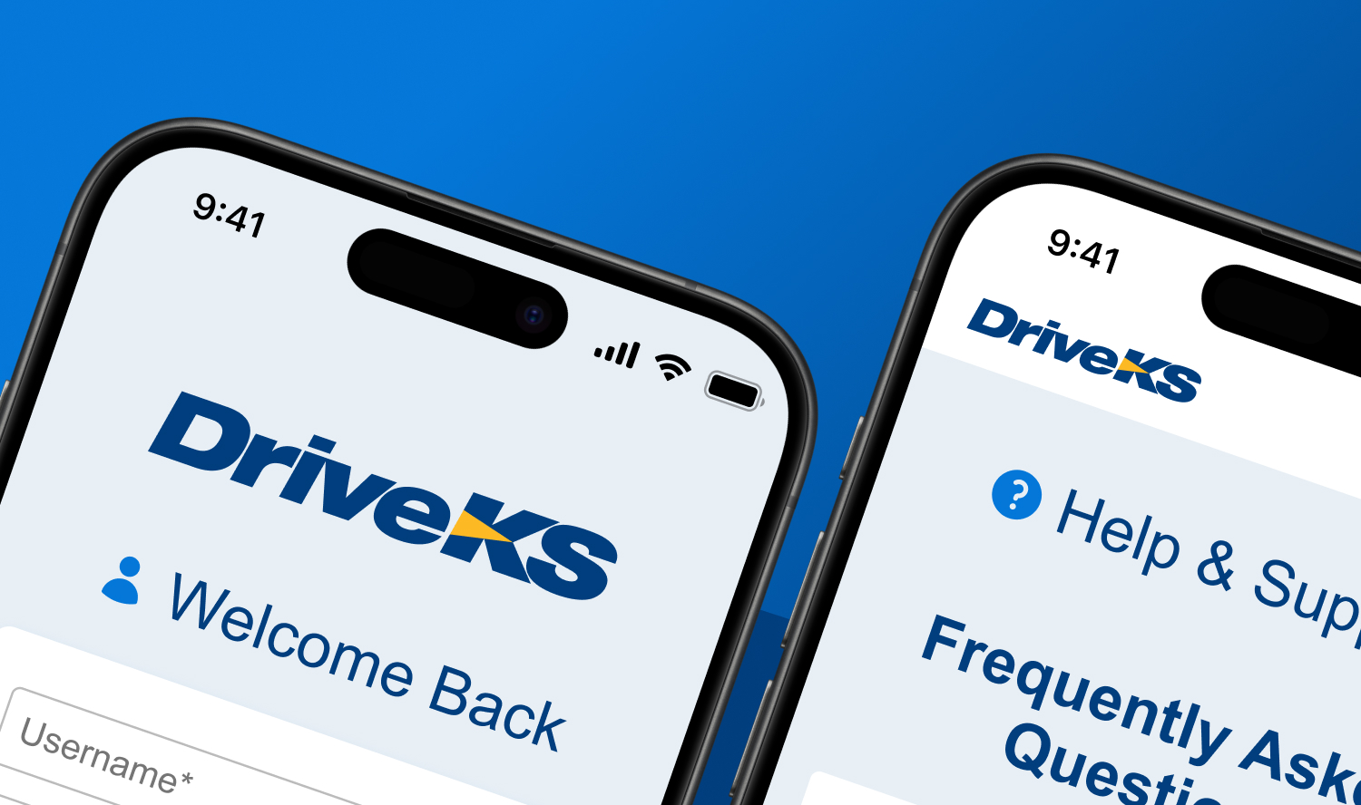
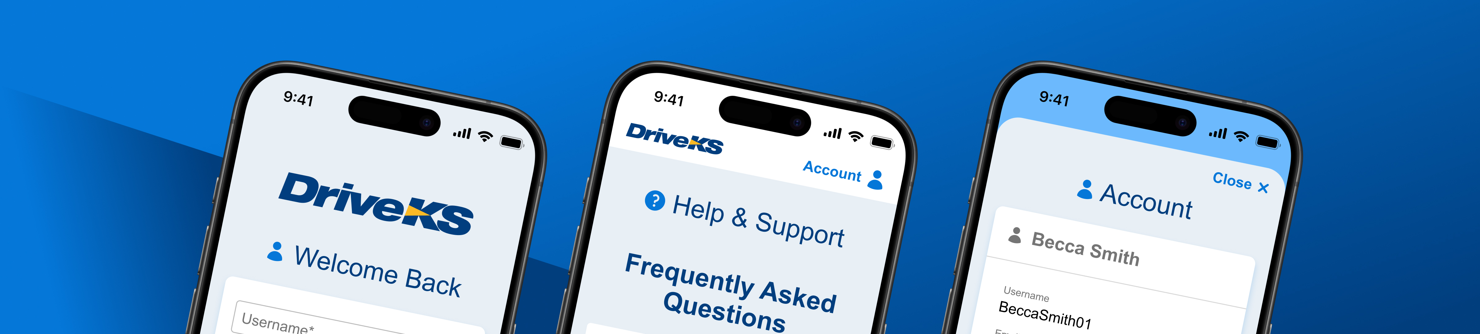
When the Kansas Turnpike Authority (KTA), which manages and maintains a toll road that spans the state, was ready to switch to a cashless solution, meaning no more toll booths, it came to Howerton+White to design the new online payment system. The resulting website, DriveKS.com, and accompanying app were born from months-long research, testing, and design.
We sat down with Josh Becker, the site’s architect, and director of user experience design at Howerton+White, to discuss the project’s many challenges, solutions, and unexpected rewards.
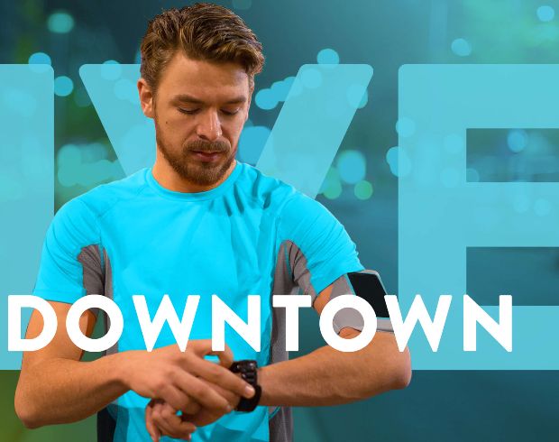
This is a big change. When you think about how many drivers will use that road, the website, and the app daily, we’re talking about a lot of traffic. Did you feel the weight and responsibility of that as you worked on this project?
It is an important system, but I enjoy doing it so much that I don’t think about that. There are so many different kinds of interactions in the system that it is just super fun to think of the best way to use it, to put myself in the users’ place, and solve the challenges before they ever see them.
What was uniquely challenging about this project?
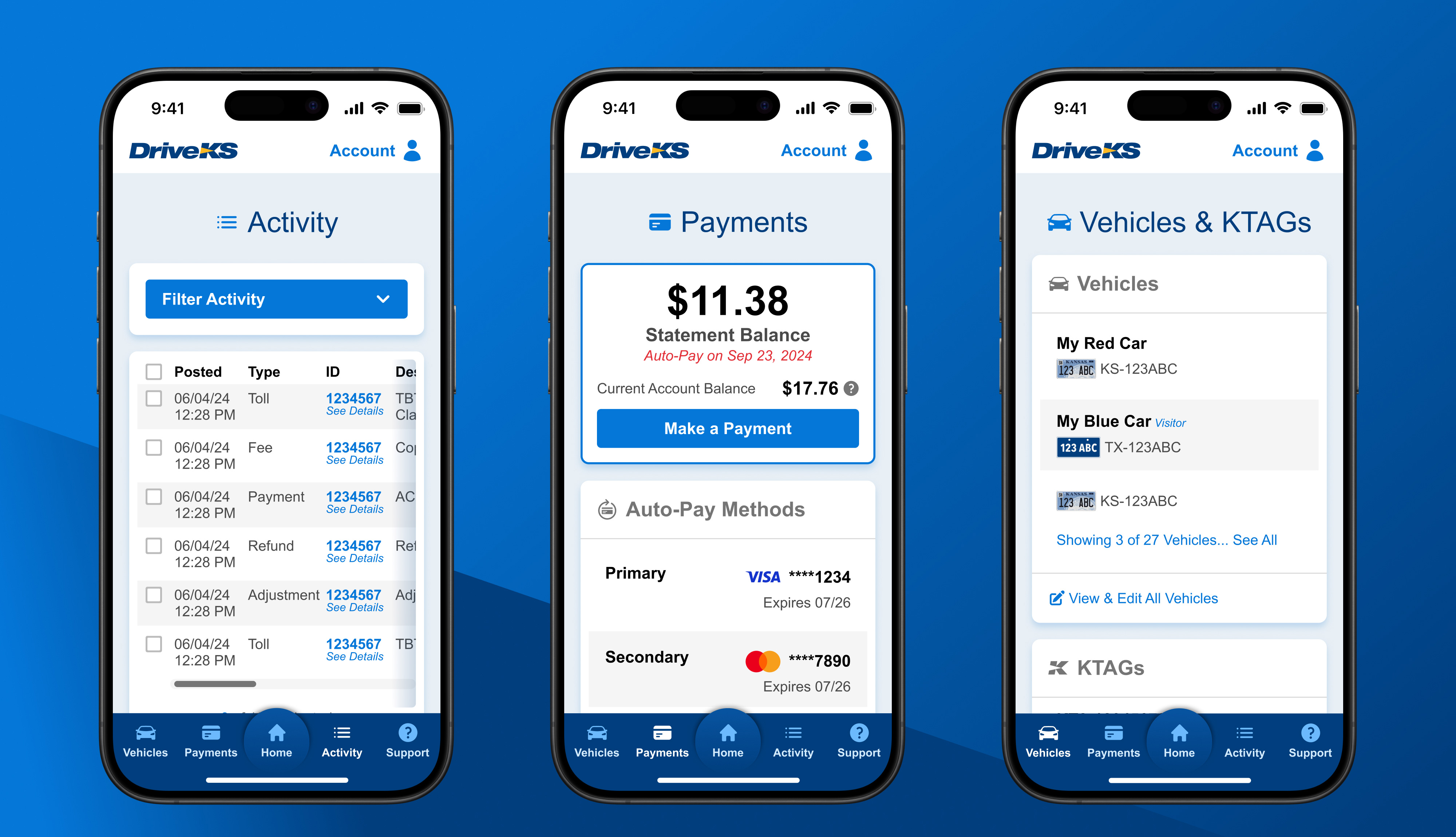
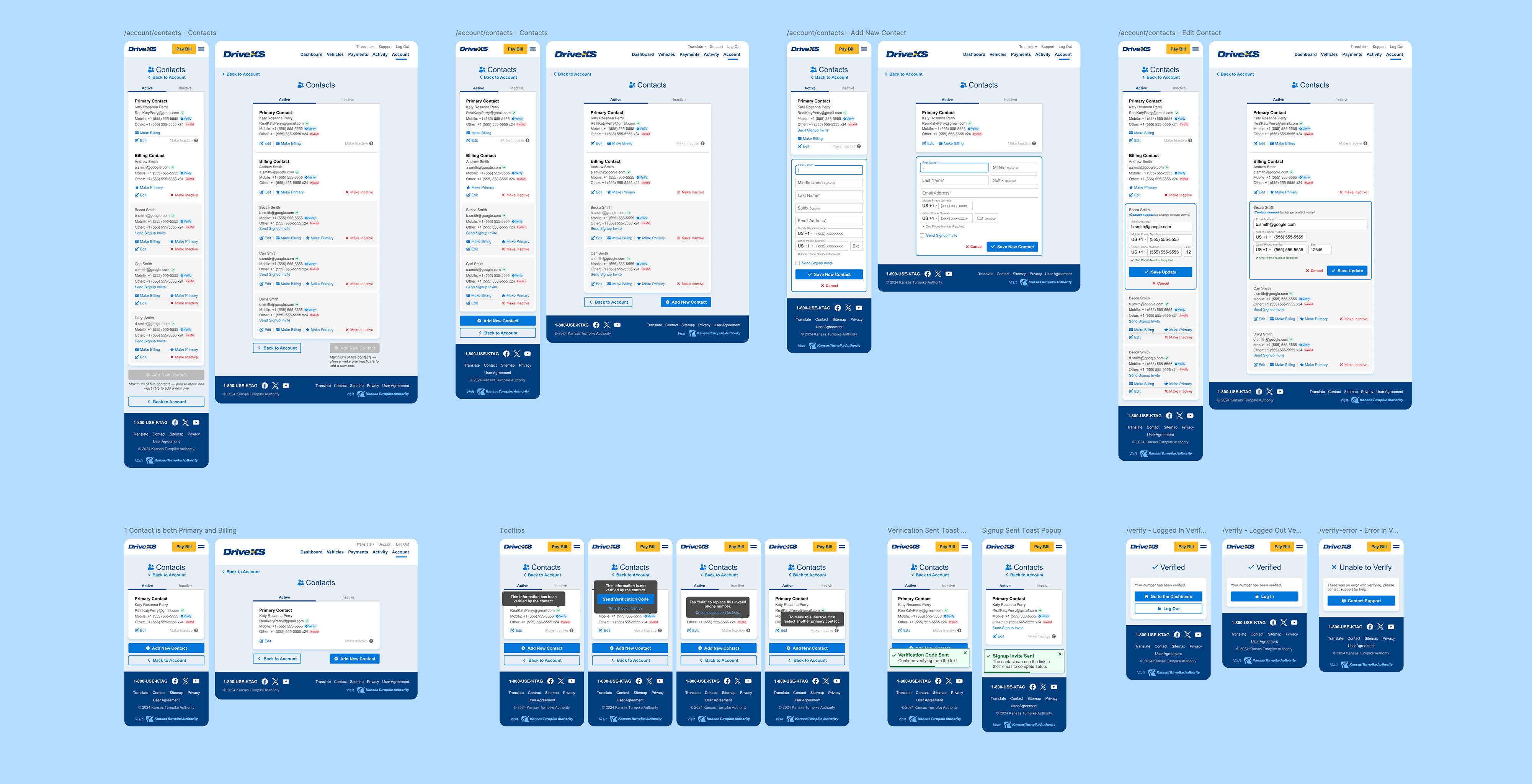
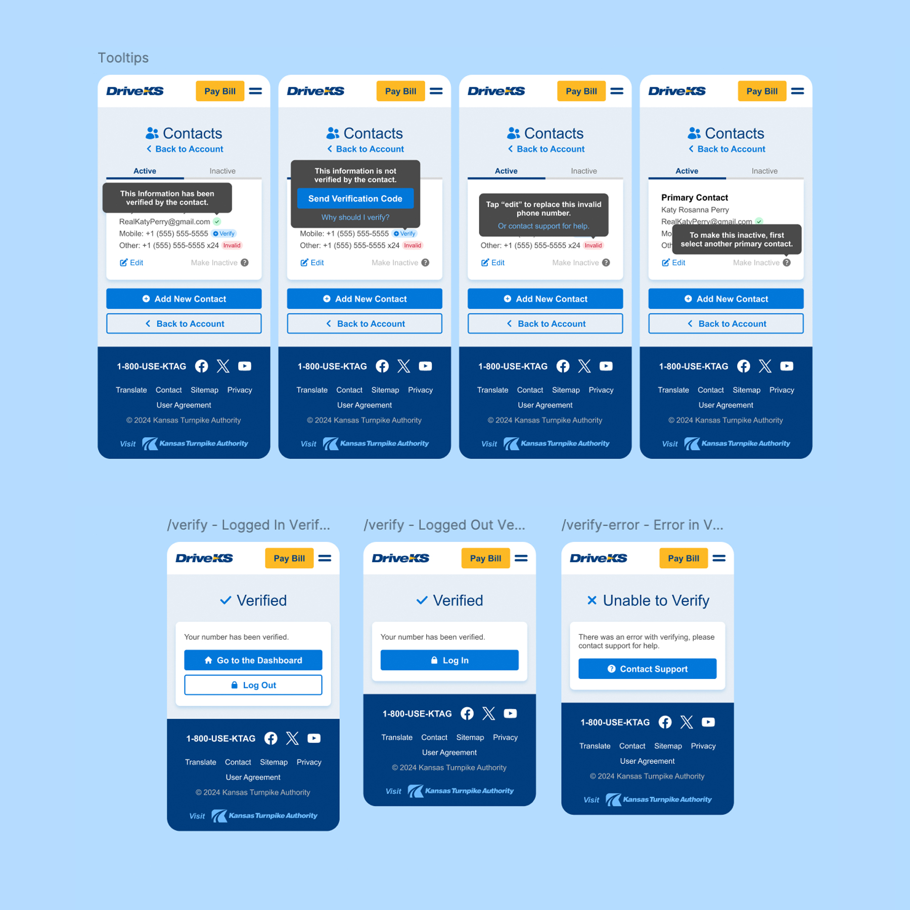
The scope. Every page has many pieces, and they all need to be a cohesive experience for the user. They can’t see one design on this page and then go to another and see different typography, buttons, or interactions. We had to create a pretty deep system that the developers at KTA and the app developers could use so that everybody could be on the same page. So that was challenging. Also, working through all the audience’s needs and identifying their issues.
How would you sum up the solution?
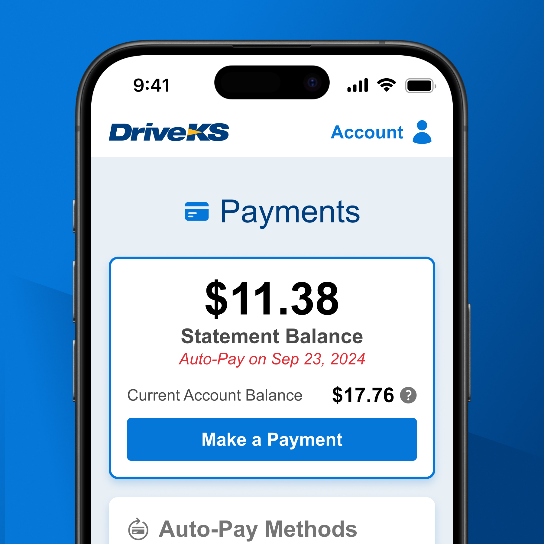
It was about being user-centric. We defined the users’ goals so we could make sure that they could easily accomplish them. The stakeholders also have goals. They want to convert more users to having KTAGs in their vehicles and reduce the number of calls that come into the call center. So, there are certain things that the stakeholders want out of it, but really, to make the best product, we keep the end user in mind.
Can you talk about the research and thinking that went into designing the user experience? It has to be more than knowing where to put a button, right?
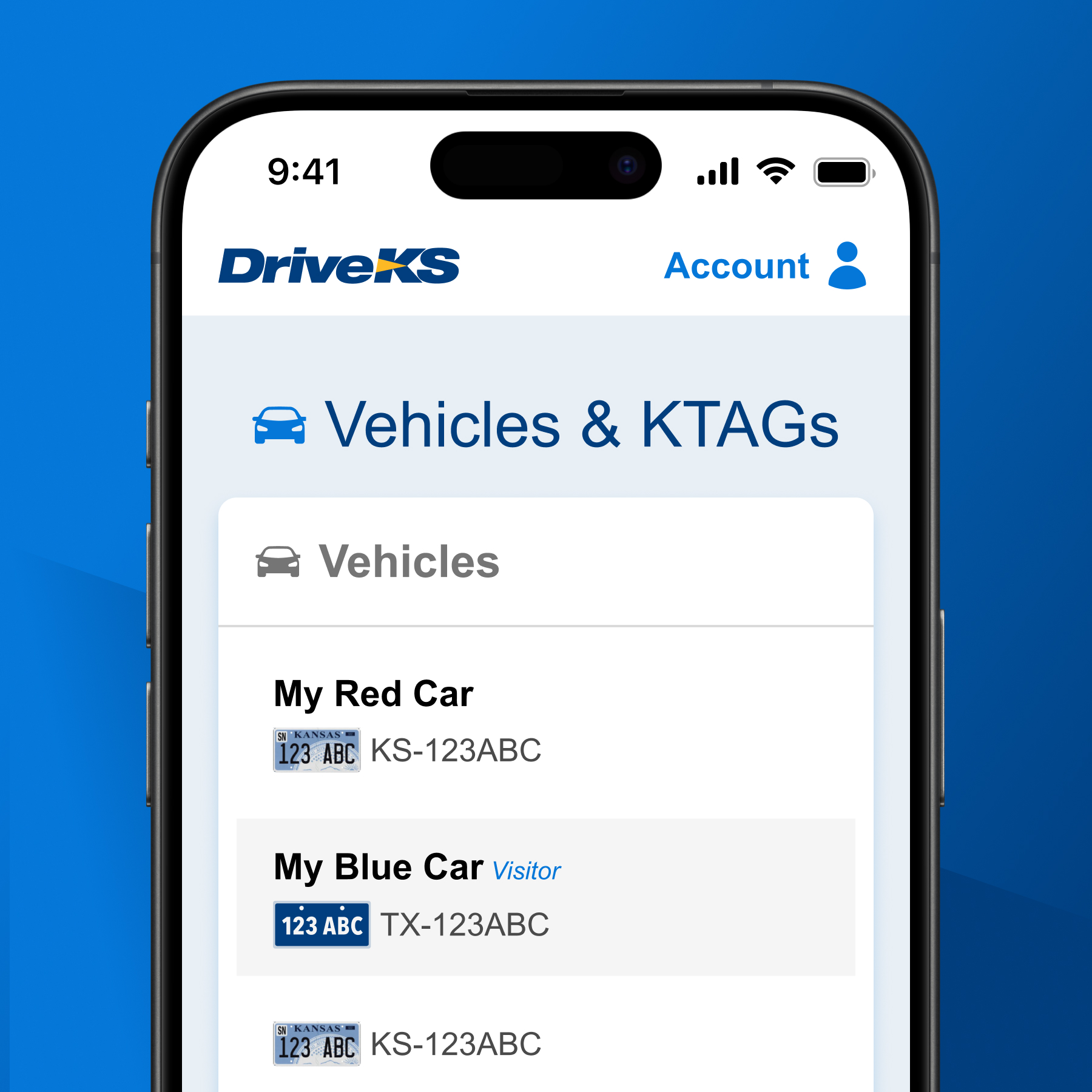
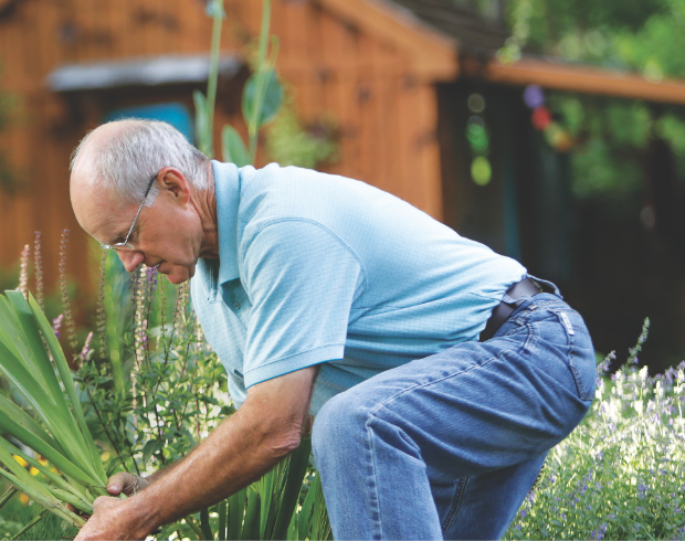
It is. It’s about knowing the different audiences. We identified that some people wouldn’t want to do anything on the site other than pay their toll because they received a letter after they drove on the road. So, one audience wants to get in and out, while another wants to log in and see their balances and toll activity. Then, there are the commercial accounts that need to see a lot of data and download reports. So we thought about all those different users. We examined the competitors and how they were solving those issues, and that really helped us narrow and refine the best solutions.
How did you define these audiences?
Initially, we looked at the casual user, the heavy user, and the medium user. So we had these groups of users, but there was a lot more to it because some heavy users were just traveling to Kansas City every day for work, and some were managing fleets. So, we had to collaborate with the KTA team to create more specific personas. We ended up with 17 different personas, and they each had their pain points and what they were trying to do on the website. So it was nice to look deeper into those personas and identify with that substance, get into their shoes, and see where they might have issues, what they don’t want to mess with, and what they want to get out of it.
You mentioned the stakeholder goals of converting more users to having KTAGs. How did you address that?
KTAGs are a benefit to users because they save money, but also to our partners at KTA, as the tags make it easier for them to use the system and handle their clientele. So, we established some UI that helps promote signing up for KTAGs and part of that conversion language is identifying what drivers saved or could save when they sign up for KTAG. When you log in to the dashboard, you will see the savings you could have made by using a KTAG. That encourages conversions and carefully placed call-to-action buttons to order the KTAG make it easy for the user.
Finally, change can be hard. Do you think that paying online rather than on the road will be an easy transition for drivers?
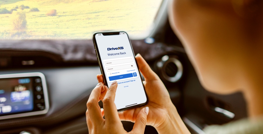
It’s absolutely a better experience. Part of our job was to help tell people how to use it, and I think they’ll quickly identify how easy it is to use because you don’t have to have made any steps ahead of time. You don’t have to have signed up for a KTAG or kept quarters in your car, there are no prerequisites. There are fewer barriers now. You just drive.