Kansas Turnpike Authority

Driving Change

Challenge

Facilitate a transition to fully cashless tolling for a toll road spanning 236 miles and serving 120,000 drivers on a daily basis by informing the public about the change and providing the user tools required to support the new payment system.

Solution

Develop foundational brand language and visuals to support a full suite of materials informing the public about the new cashless tolling system and enabling ease of use through informed UI/UX website and application design. 

Driving Change on the Kansas Turnpike

The Kansas Turnpike Authority maintains 236 miles of toll road that extends from Kansas City to the Oklahoma border. The roadway passes through major cities in the state, including Topeka and Wichita, with toll booth stops along the way. To provide drivers with a better experience, the Kansas Turnpike switched to a fully cashless tolling system, meaning drivers would no longer need to stop to pay tolls. All payments would be made online, before or after a trip.

The authority sought out Howerton+White to serve as a consultation partner. Together, we developed a comprehensive strategic plan to launch a brand identity to support cashless tolling. In addition to the cashless tolling brand initiative, we developed a plan to update the existing brand identities for both KTAG and the Kansas Turnpike. This created alignment between the KTA and its KTAG and cashless tolling products, presenting a cohesive overall brand identity.

Road Trip Research

About 120,000 drivers use the Kansas Turnpike each day for commuting, leisure, or business. Developing messaging that would speak to every driver presented a challenge. Our approach was to create messaging and user personas structured around two major audience segments: the everyday and commercial drivers. We kept in mind that drivers in either group may or may not be residents of Kansas, and they may not be accustomed to using toll roads regularly. 

After establishing these major audience segments, we created user personas within each target group. Our user personas considered the needs of different age groups, levels of tech-savviness, geographic locations (rural and urban, out-of-state vs. in-state), and additional key demographic characteristics. Knowing the target audiences allowed us to develop materials that would be effective in reaching them now and in future campaigns.

Naming a Cashless Tolling System

Extensive research and testing led us to “DriveKS” as the name for the new payment system. It establishes the location and function it serves, making it easy to understand for all audiences. Critically, the name “DriveKS” is short and concise, ensuring it adheres to roadway signage regulations. 

It was important for the name of the cashless tolling payment system to be closely connected to the KTAG product, as DriveKS would not only handle cashless tolling payments but also manage customer KTAG accounts.

Developing a Complete Brand Identity

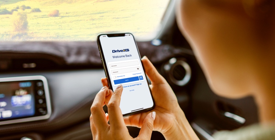
The payment platform DriveKS was a new product and a new way of using an existing service that needed explaining to the marketplace. It also needed to live in harmony with other brands in the KTA universe. That meant aligning the brand’s logo and other visuals with existing Kansas Turnpike Authority and KTAG brands. Ultimately, we evolved the look of the legacy brands to align with the new style created for DriveKS. But first, we had to communicate to drivers of the toll road that change was coming.

“We needed to allay some of the fears about what this all means to the end users,” said Craig Tomson, Creative Director at Howerton+White.

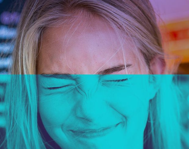
Our creative team sat out to craft a message and look that was approachable and friendly, and that communicated the important takeaways in an instant. The “Go” creative, for example, features an image of a vehicle passing beneath one of the new gantries in a speedy blur. “It spoke to me,” said Tomson. “It’s high energy. It’s transient, fast, and easy. You just keep moving.”

It’s subtle, but the expression varies depending on the product or audience. For example, the KTA brand is about the roadway, while DriveKS assets are more about the human experience. And then there is the KTAG, a transponder device, where the images and illustrations are more technical.

Along with the brand language and messaging, the developed expression was compiled into a brand book the KTA could use as a reference and resource to produce on-brand assets as it readied for the launch of the new system and beyond. 

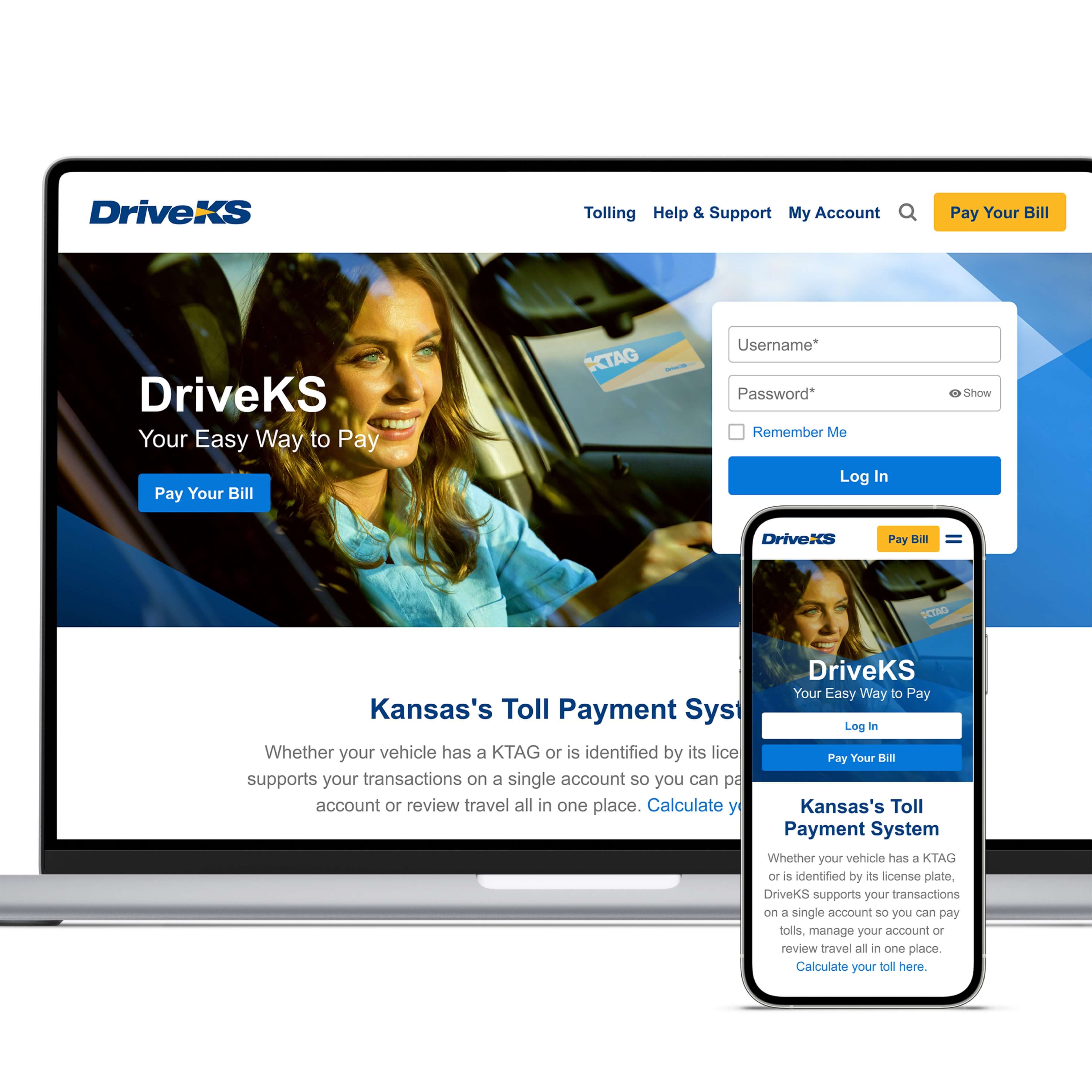
We also created a full suite of support materials for internal and consumer-facing platforms, including an infographic suite, presentation decks, a stationary system, billboards, and plaza signage, templates for digital communication and digital display, video templates, internal reporting forms, and consumer-facing invoicing statements. 

Close collaboration with the Authority at every step made implementing the new brand and evolving legacy brands more effective. 

“We were having almost weekly conversations about how this all works,” said Tomson. “I think that really paid off. It created a sense of ease for both parties to express themselves.”

Designing the Website and App

For the cashless tolling system to be successful, the payment platform needed to provide users with the best possible overall experience. To make this goal a reality, we worked closely with KTA and other partners to develop a comprehensive digital interface, including a redesigned website as well as a completely new mobile app. 

Our internal user interface/user experience (UI/UX) team collaborated with the KTA team to develop detailed and diverse user personas that provided insight into consumer desires, pain points, and behavior patterns. These personas informed our development approach and resulted in a UI/UX strategy that synthesized consumer wants, needs, and preferences with KTA’s greater goals. 

The website and app UI provide a simple, straightforward method for users to pay their tolls. It also seamlessly integrates conversion opportunities with carefully placed call-to-action buttons encouraging users to order a KTAG. At all points, the approach was to provide users with a better experience and fewer barriers to paying tolls and having a smooth trip. 

Updating KTAG for Cashless Tolling

The KTAG, an electronic transponder introduced in 1995, is an established product of the Kansas Turnpike Authority. With the launch of the DriveKS toll payment system, KTAG users would transition from the old payment system to the new one. The KTAG brand was updated to align with the new DriveKS brand standards, ensuring unity and integration.

Through messaging and visual expression, we made clear the integration of KTAG, DriveKS, and the Kansas Turnpike Authority. Our team created a suite of consumer-facing materials to promote KTAG and inform audiences about KTAG’s transition to the DriveKS platform. Support materials included transponder and mailing kits, invoicing forms, a stationary system, communication templates, presentation decks, and additional collateral. We also updated the KTA website, including a comprehensive UI/UX design overhaul.

A Refresh for the Kansas Turnpike Authority

A refresh of the Kansas Turnpike Authority brand identity ensured alignment with DriveKS and KTAG. To support internal operations, we developed a brand atlas establishing key messaging and a visual foundation. From there, we created a suite of updated materials to support the organization, including updating internal reports and forms. By doing so, employees could naturally adopt and internalize the new brand identity and become ambassadors of the brand in their external communications and interactions.